
Overview
• I led end-to-end design and deployment of Wiley’s first proprietary eReader to replace an outdated third party tool.
• Wiley Reader is available on iOS, Android, and as a web app.
• Within 12 months of launch, we achieved 2.2m users and 4.8 stars in the App Store.
$4m
annual savings
2.2m
users
4.8
stars (App Store)
User Quotes
"REALLY EASY TO USE"
"user friendly ebook"
"Easy to use. I like the highlight, copy text, and listen as you read functions available."
"easy to navigate & helpful for homework"
"…the audio playback is sweet!"
"I hadn't used Wiley before my current course but I was pleasantly surprised! I think that the whole structre of the sight, not just the textbook, was done incredibly well!"
"Can be easily navigated. No hassles."
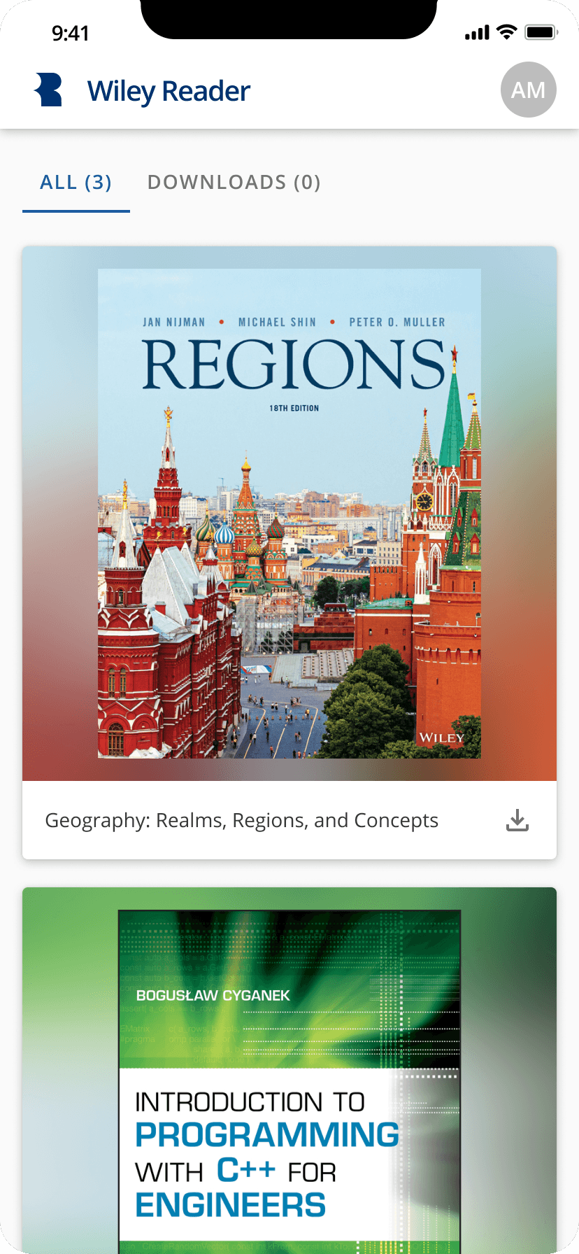
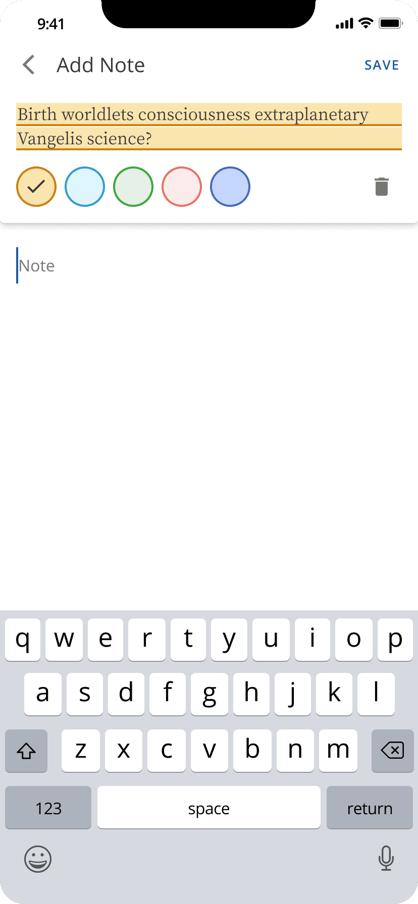
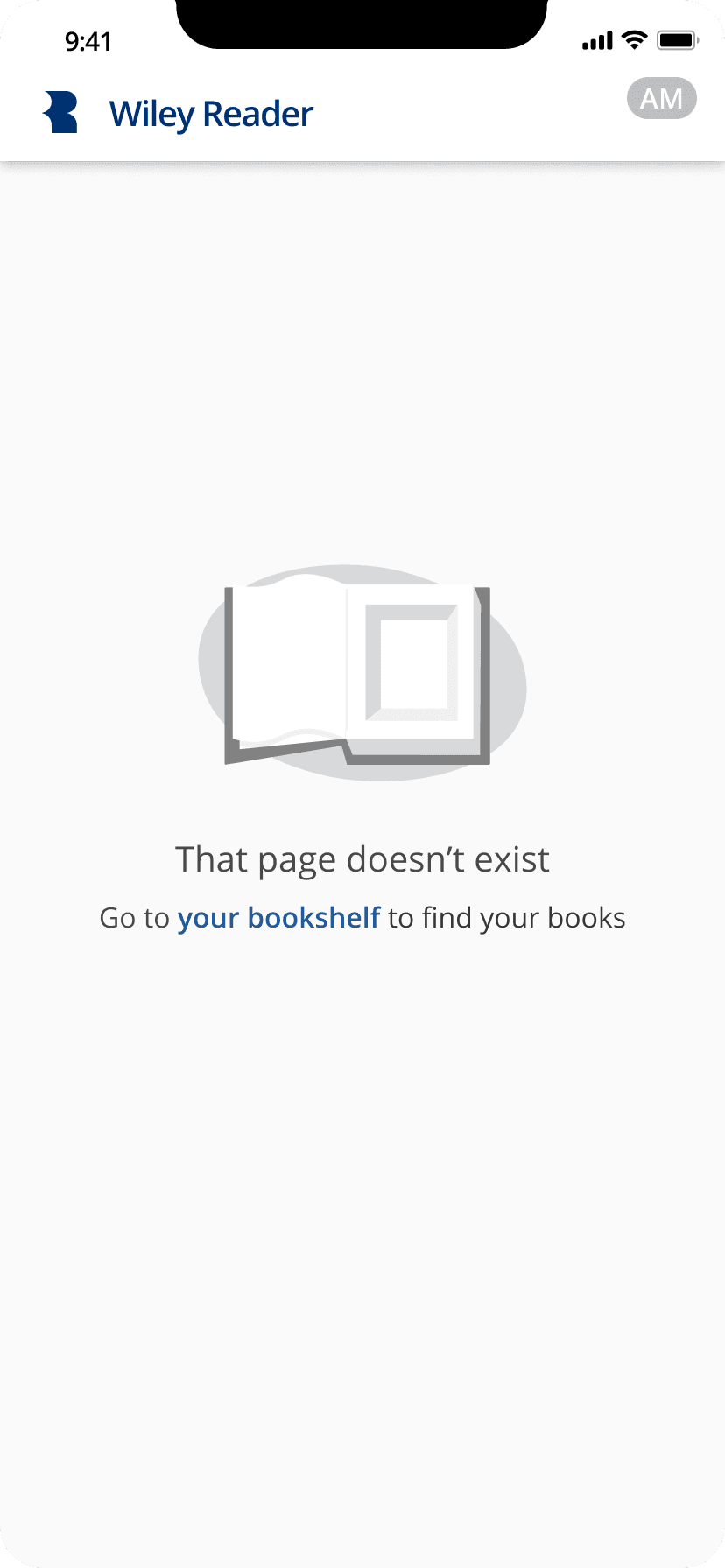
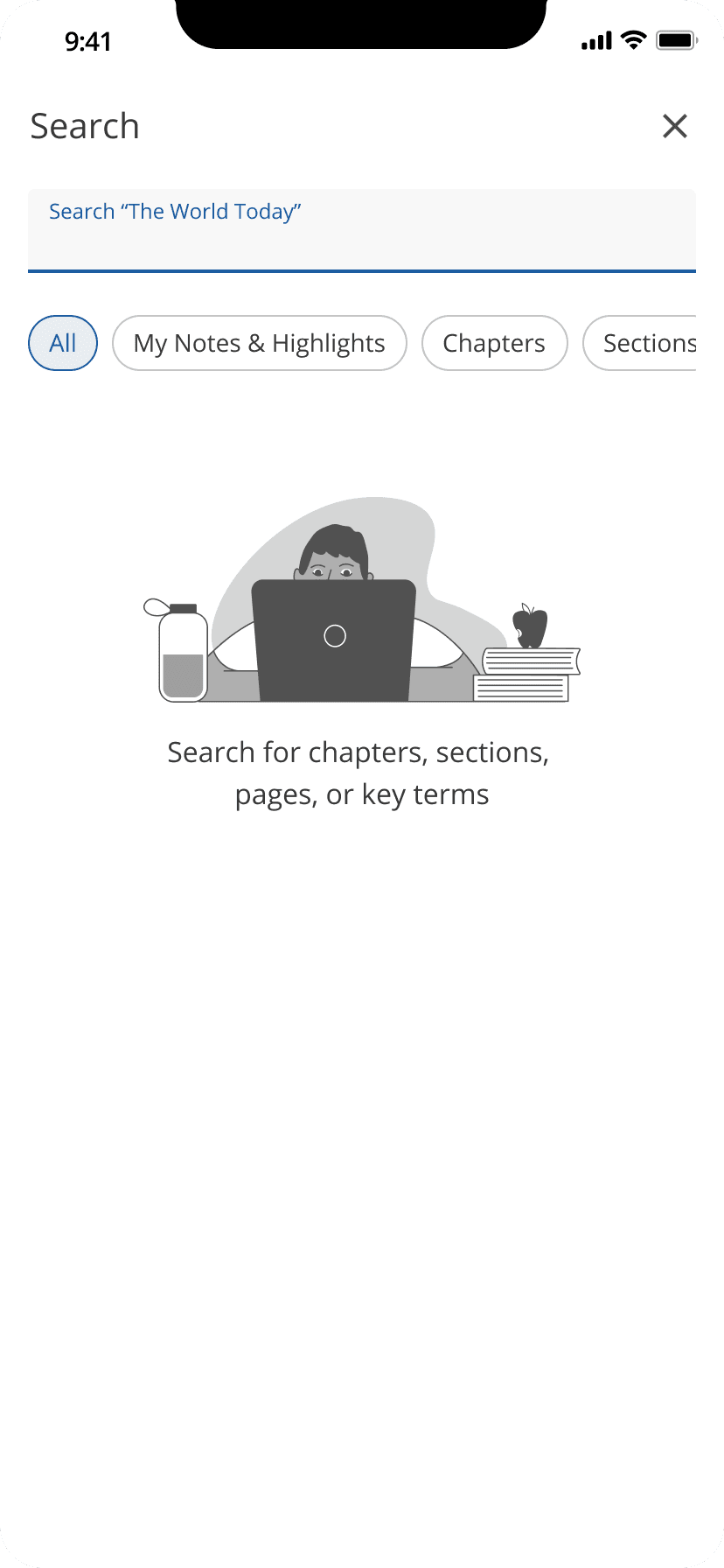
Mobile Gallery


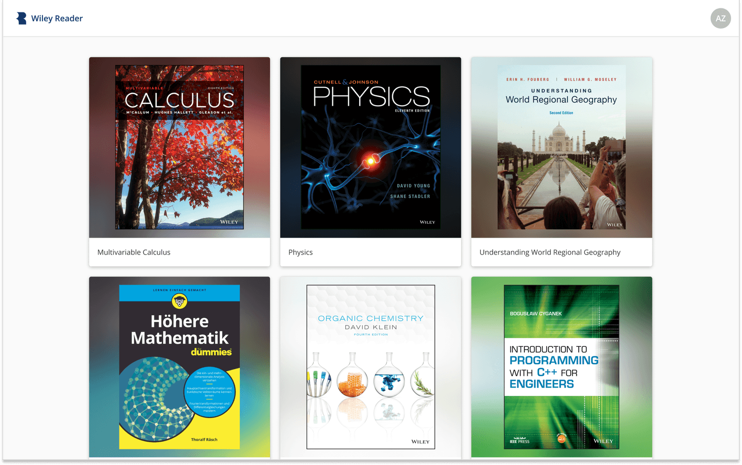
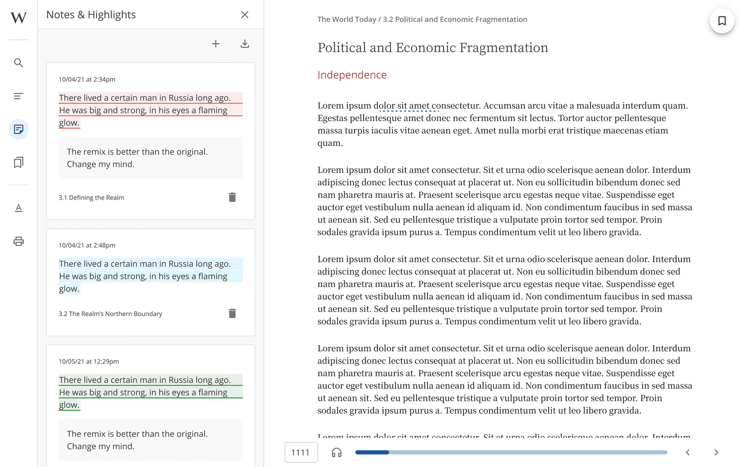
Desktop Gallery
Key Requirements
Key Requirements
The existing question player
needed a UI update to bring
it up to speed with the rest
of our products
The existing question player
needed a UI update to bring
it up to speed with the rest
of our products
Primary Goal: get a fresh understanding of how higher ed students read textbooks.
Survey: We put together a survey and deployed it to existing and non-users, including college students of various ages and backgrounds
Competitive Review: We also did a comprehensive deep dive on our primary eReader competitor to make ourselves aware of how others were solving similar problems.
Findings: We expected to find some standards to lean on from giants like Kindle — which we did — but we were also surprised to find many elements that were getting in users’ way: unnecessarily complex bookshelves, clunky navigation, and deeply tiered settings menus. Many users felt that UI was getting in the way of their reading. We went in with a goal of keeping the focus on the book content, but balancing that delicately with making core functionality easy to reach.
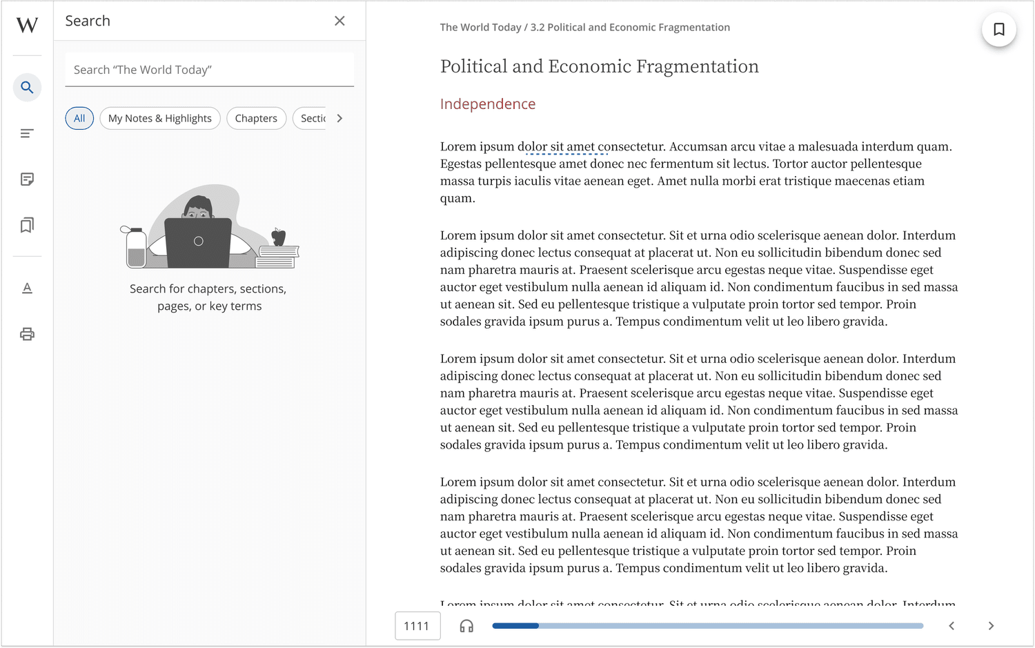
Bookshelf: After exploring numerous layouts, we settled on an excessively simple bookshelf: app bar with Reader branding, account settings, and a card to open each book. Because the bookshelf wasn’t intended to perform a marketing or commerce experience like some other reading apps, we were able to truly focus on enabling the user to quickly access their books.
Reading Experience:
Left Nav: On desktop we decided to use a persistent left nav to support jumping back to the Bookshelf, search within the book, the table of contents, notes & highlights, bookmarks, display settings, and printing pages, which, outdated as it sounds, was a must-have for our higher ed customers. In the mobile app, the left nav is replaced by a top nav with a hamburger menu to save on precious real estate and keep the user focused on reading.
Footer: The footer contains the page number (in the form of a text field, which can be used to navigate to a specific page. This is essential for students who are assigned to read page x to x), audio launch point, a progress bar, and back/forward navigation.

Designed and delivered the Wiley Reader in just under 10 months, in time for the Fall 2020 academic semester.
We not only delivered a clean, cohesive user experience, including a seamless purchase to access flow, we unlocked $4m annually.
In addition to a desktop app, we designed and developed Android and iOS apps, the latter of which has a 4.8-star App Store rating.